
Google announced the Android P Beta on stage today at Google I/O and the next flavor of the company’s mobile OS is looking quite fabulous. Of course, the biggest difference is in the new gesture-based navigation bar, which I know resembles the one on the iPhone X.
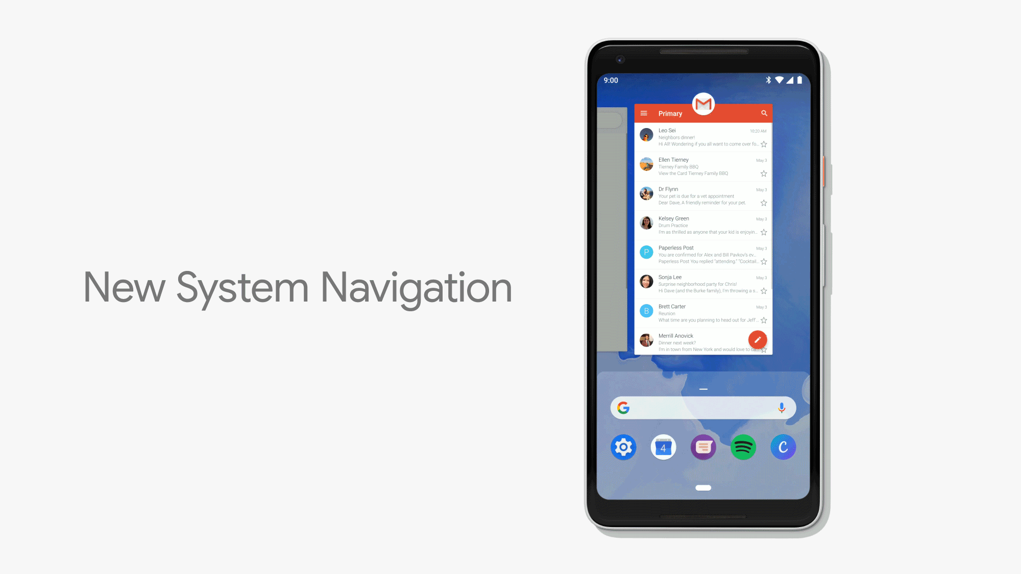
Falling in line with rumors, Google is doing away with its conventional three-button navigation bar (not completely) and has now added a pill-shaped home button instead in Android P. This is still the home button and you can tap it to return home from inside any app that’s open on your screen. However, it’s not without controversy.
With the multitasking button gone, you now need to swipe up on the home pill to see recently opened apps. They’re no longer stacked on top of each other, like in the most recent stable version of Android, but instead appear a horizontal cards next to each other. You can swipe left and right to scroll through them.
But, if that feels like a hassle, then Google has added a nifty ‘quick scrub’ gesture where you can hold the home button and swipe left or right to skim through the list of recent apps. This gesture also acts as a quick switch button and you just need to flick it once to jump between apps – use the haptic feedback as the guide to get used to this.
Google believes that the new gesture navigation will make it easier to operate the phone, especially as screens are getting taller with each passing day. This is also the reason the recent apps are laid out horizontally now.
As you can see in the GIF above, the back button hasn’t been completely removed from Android P but instead it only appears when needed- which is most of the times. You’ll see the home button on the homescreen and the back button will surface contextually within apps.
What’s highly controversial is Google’s implementation of the app drawer in the new system. You are no longer shown a slide-up app drawer on the home screen, instead it can only be pulled up by a long-swipe to the top from the pill, or by a double swipe. This is a hugely contentious decision on Google’s part, and could earn the fans’ ire.

Another thing we hate about the new navigation is using apps in split screen mode. Well, it is going to prove a hassle without that trusted multitasking key. You’ll now need to tap on the app icon at the top of each app’s recent card to uncover a hidden menu, which houses the ‘split-screen’ and ‘app info’ options. You can tap on the split-screen option and choose the second app, which is a horrible alternative to the current experience.
Google finally seems to have adapted to the changing times and taken inspiration from the iPhone X, which might not please fans. Google’s VP of Android Engineering, Dave Burke, on stage said Google “had been developing this new navigation system for more than a year,” and it will be a while before fans warm up to it.
So, do you like the new navigation bar? Hate it? Tell us your thoughts in the comments below.