Apple has finally released the final version of their most recent update – iOS 18. As always, the company touts this version as their biggest update to iPhones. While I agree to that for iOS in general, I’m not exactly sure if that’s the case for the majority of us. Having tested the update since it came out in Developer Beta and then moving to the Public beta, here’s my review of iOS 18, running on an iPhone 15.
iOS 18: Changes I Like
With iOS 18, Apple’s primary focus has been customization and as soon as you update to the latest version, that’s the first thing you’ll notice. So, let’s start with that first and move on to the rest.
Home Screen Customization
To help iPhone users personalize their home screen set up better, Apple has taken a step from Android’s playbook and has finally allowed deeper customization options. You can now drag and move apps to any part of your home screen without using blank icons like before. This could please people who are peculiar about how a background appears on their home screen.
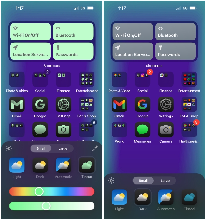
To add to this, app icons now have a Dark setting which applies dark mode with black backgrounds on all icons on the home screen, Spotlight, and App Library. Apple has one-upped this feature by introducing a “Tinted” option. What it essentially does is let you apply a desired color of your wallpaper as the highlight color on icons and widgets. Sort of like “Themed icons” that were introduced in Android 12. I like this inclusion but it needs refinements since tweaking the right color of tint for a particular background can take an eternity.
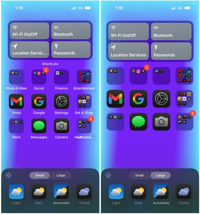
Perhaps, my favorite home screen feature now is the ability to bump up icons to a larger size which in turn hides app and widget names from the home screen. For years, I’ve yearned long for this feature as it makes my main screen look minimal and appealing. Since I don’t often change my home screen setup, I have no use for text labels under home screen items anyway.
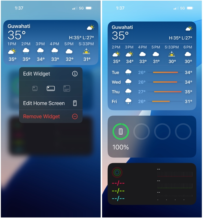
Another minor feature is that you can now switch an app’s icon to its widget or vice versa. Just long-press on an app/widget and choosing a desired option from the overflow menu. This will only work on apps that support widgets. You can also use this method to resize widgets on the Today View screen.
New Lock Screen Controls
It isn’t just the home screen that benefits from this freedom of customization, the iOS lock screen also gets one major upgrade. You can now remove the Camera and Flashlight controls from the lock screen and replace it with other controls, shortcuts, or even apps. If you’re a minimalist, you can simply keep the bottom corners free of any controls as well.
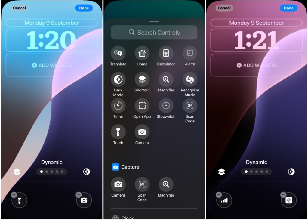
Lastly, there’s now a “Dynamic” wallpaper that works just like on a Mac. It cycles through different iOS 18 wallpapers at different times of the day and changes appearance between Light Mode and Dark Mode.
An All New Control Center
For years, Apple has preserved the look of the Control Center. So the one, you may see on your iPhone now, wouldn’t be much different to how it was on iOS 11. Not anymore, though. With iOS 18, my version of Control Center may be something entirely different from yours. That’s cause, Apple now lets you customize the Control Center by removing any of the controls from this page and adding any number of controls (with no upward limit).
So, I no longer have to deal with the squircle box of network controls, as I can replace them with individual icons instead. Control Center now offers a more homescreen-like experience with multipage controls. If a single page of controls doesn’t do the job, I can add more pages with different controls and resize them to my preferred appearance.
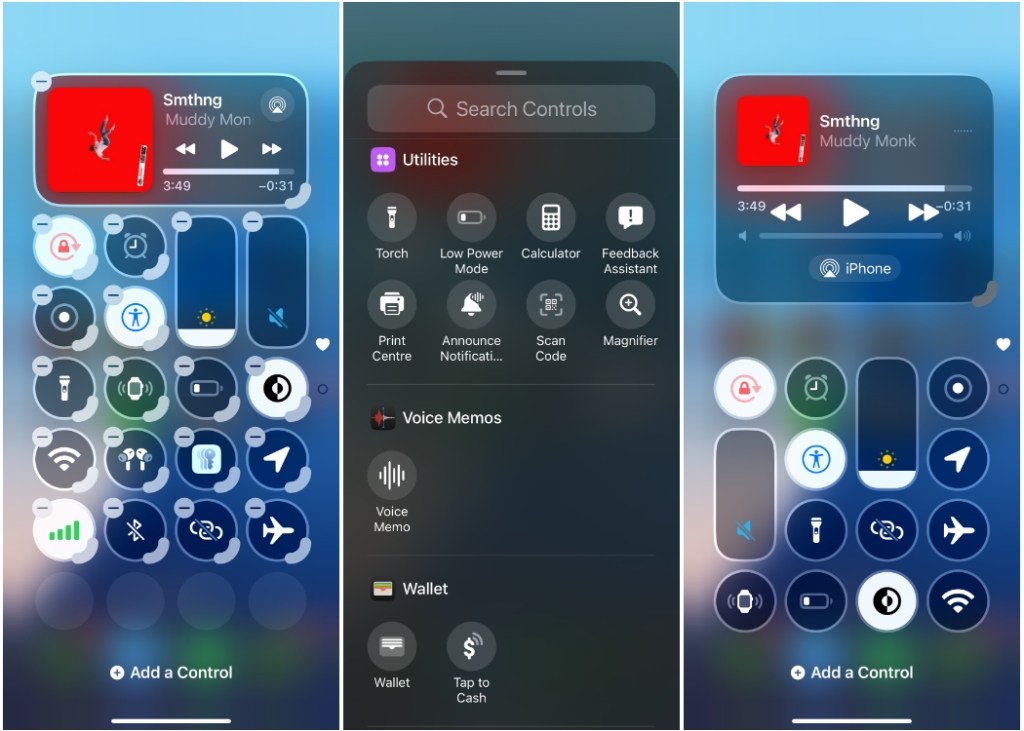
Being a minimalist, the new Control Center is one of my favorite iOS 18 features. With a bit of tweaking here and there, I’ve managed to set it up the way I want it. It’s also now easy to set up. I can access all the controls directly from the edit screen instead of navigating to Settings > Control Center which was such a hassle until now.
Ability to Lock/Hide Apps
Phones are personal to us, and you won’t want anyone else to access your private messages, photos, or apps you use. With iOS 18, I can either lock apps with Face ID (or Touch ID or device passcode) to prevent others from opening it or hide them to conceal its presence from my iPhone. All I need to do is long-press on an app I want to secure and select Require Face ID. You can either choose to just lock an app with Require Face ID or use the Hide and Require Face ID option to conceal the app away from the home screen.
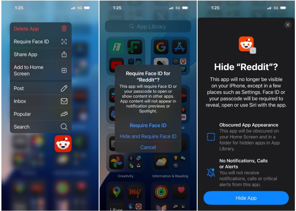
The apps I hide will then only be accessible from App Library > Hidden Apps. To secure my privacy, iOS will restrict incoming messages from the locked/hidden apps and any content inside the said apps won’t be indexed by Spotlight.
New Passwords App
There’s a new app on iOS 18, and I’m glad it’s finally here. For years, I’ve relied on Apple’s iCloud Keychain to store and access passwords. And the only way to do that until iOS 17 was by using the Settings app. I even had a custom shortcut that took me directly to the Passwords screen, without needing to navigate inside Settings every time.

With iOS 18, the new Passwords app is here. From the get-go, it looks a lot like the Reminders app. There are boxes with colorful icons that will let you access your passwords, passkeys, codes, Wi-Fi passwords, security recommendations, and deleted passwords. The app also offers easier ways to copy exactly a password/username or share it someone via AirDrop.
Improvements to Messages
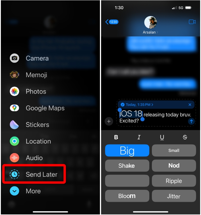
Among app-based updates, Messages is getting a handful of improvements. I can now schedule messages for later, send playful-looking texts with rich text formatting and animations. Message Tapbacks are a welcome addition, as it lets me use emojis and stickers as reaction.
The biggest change here is support for RCS messaging, which means my friends on the Android side of things can also view read receipts, typing indicators, and send large-size media files.
T9 Dialer, Finally!
Unless Messages, the Phone app hasn’t recieved any major updates barring a new T9 Dialer. Yes, you read that right! Your iPhone will let you dial your friends directly from the keypad, like the old days. I can now use single key presses on numbers corresponding to the letters of someone’s name to get their contact as a suggestion.
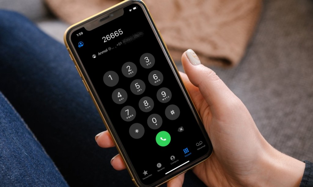
It’s the easiest way to search contacts I want to call. So, I no longer need to search for their name manually inside the Contacts tab. There’s a guide we’ve already prepared to help you use iPhone’s T9 Dialer on iOS 18.
iOS 18: Changes I Don’t Like
Nothing is ever perfect and so is iOS 18. While it brings a lot we wanted to see on our iPhones, there are some features I think are half-baked and not up to the mark.
Photos app is a Mess
Now, you might have wondered why I didn’t mention the redesigned Photos app earlier. There’s a reason why. With iOS 18, Apple has changed the UI significantly inside the app, to the point where I see more stuff on the same page than I ever wanted. The company’s aim here is that the single-page layout will help me rediscover my old memories. But is it what people really want to see? I doubt it.
This particular redesign goes against Apple’s conventional approach – laying out items into categorized tabs that are easy enough to access. Having grown used to the same app for years, I, for one, am having a hard time finding certain items. Albums like “Favorites” which were easily accessible inside Albums > Favorites (until iOS 17), are now hidden under a slew of random albums. So, I had to mark it as a Pinned Album, to access it easily.
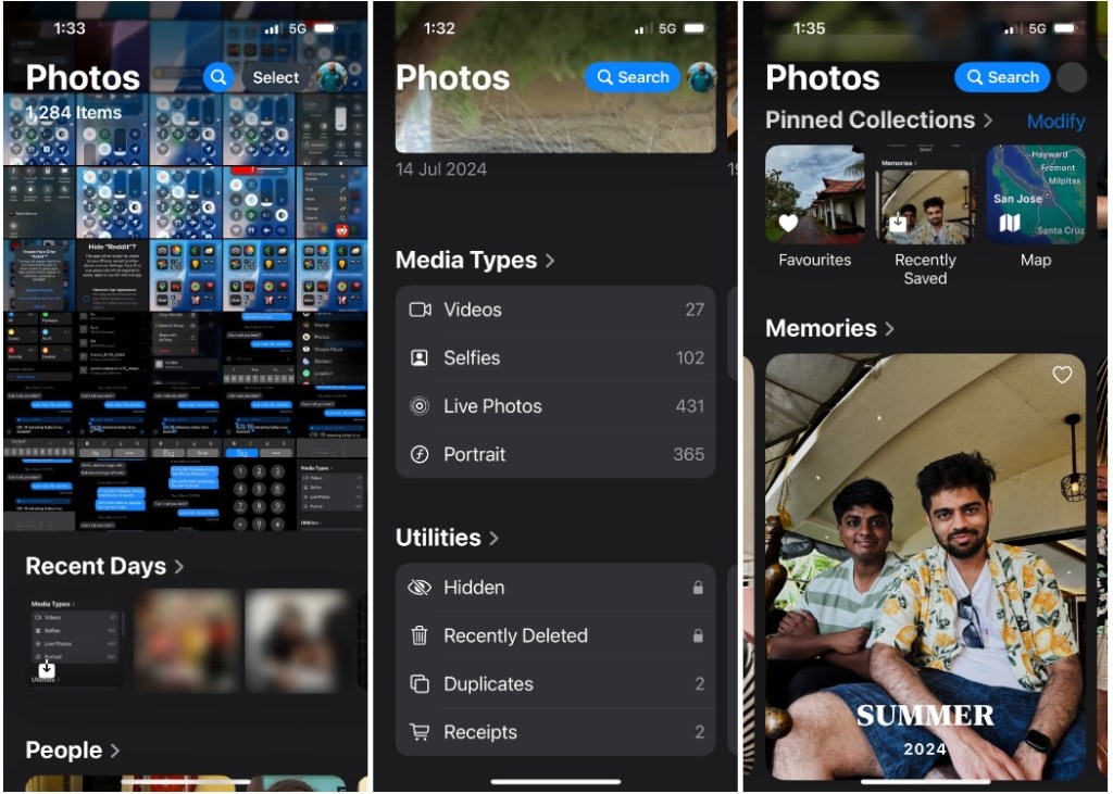
Similarly, sections like “Utilities” are now burried further down this scrollable page. So instead of getting to section directly from their respective tabs, I now have to scroll through a pile of “smart” memories to the specific section to find them. For someone like me, this whole experience is a mess, a consequence of making too many unneccessary changes.
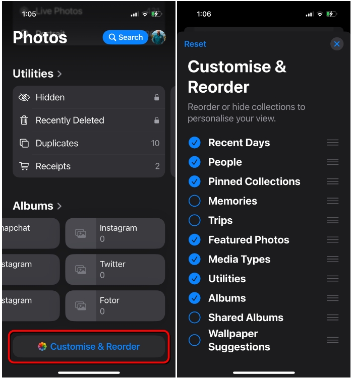
Fortunately, Apple does offer a way to avoid interacting with unwanted elements from the Photos app. When you scroll down to the bottom of the app, you’ll see a Customize & Reorder option which lets you hide certain section or collections from the main view. The tool also allows rearranging these sections the way you want, so at least there’s a way out.
No Way to Revert to Your Old Control Center
Okay, here me out. The new Control Center on iOS 18 is great and I love how I can tweak it the way I want. It’s the first thing I did when I installed the update. With so much freedom, I could remove the controls I never needed and replaced them with shortcuts and some new controls. But as you start tweaking, you may reach a point of no going back and you’ll end up with a page that’s no longer useful to your needs.
This is where I think the new Control Center needs some refinements. For starters, it lacks a “Reset” option that lets you switch to the default layout. Being tech-savvy, it’s easy for me to find a way to manually switch to the older layout. But that may not be the case for everyone. So the only way one would get to reset the Control Center to the default look is by resetting all of their iPhone settings.
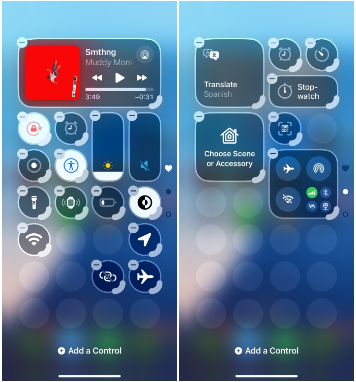
Another issue I faced when rearranging controls is that moving one of the tiles to a different location, randomly changes the location of other controls. So, it needs vigorous alterations from my end to make even the slight changes to the order of controls on the screen.
Scheduling Messages Isn’t That Easy
I’m glad that the Messages app on iOS finally offers message scheduling. But its implementation has been quite frustrating. Android users would know how easy it is to schedule messages on Google Messages. Just typing a message and long-pressing the Send button would let you schedule it at a particular date and time.
Unfortunately, Apple is yet to figure this out. On iOS 18, you need to first locate the “Send Later” option from the + menu, choose a date and time, and then type the message you want to send out. The process is, thus, not streamlined at the moment.
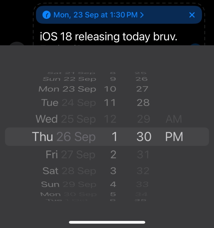
Plus, there’s a major limitation to how long you can schedule it for. You can only draft a message to go out 2 weeks in advance, not beyond that. As you can see in this screenshot, the dates beyond the 2-week mark are greyed out, thus unavailable for selection. Other messaging apps offer scheduling for months ahead, even a year. So, this kind of restriction puts Messages at a majot disadvantage.
Apple Intelligence on iOS 18: Is It a Big Miss?
One thing I’d like to point out from Apple’s WWDC event earlier this year is that the company segmented the keynote into two different demonstrations. One involved all the non-AI features of iOS 18 and the other introduced the world to Apple Intelligence.
And this has pretty much been the theme with the beta updates we’ve seen so far. The first few betas were focused on the core iOS 18 features, with no kind of AI to speak of. In the latter part of testing, the company revealed the first set of Apple Intelligence features, via iOS 18.1 beta.
But, sadly, most of us won’t even get a taste of it because the company has limited its availability. If you check this list of supported Apple Intelligence devices, you would find that only the iPhone 16 and the Pro models of last year’s iPhones are getting it. So, not even the iPhone 15 (or 15 Plus) gets the any form of AI built inside iOS 18. But do I miss it?
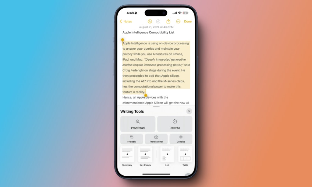
To help me clear this doubt, I spoke to my fellow co-worker, Anmol. Having tested out Apple Intelligence via the last couple of betas, he’s been quite impressed with what it’s capable of. Writing Tools, for one, has been beneficial in rewriting texts and changing the overall tone. Notification Summaries, for him, has been a game changer as it uses AI to intelligently prioritize and summarize the most important notifications at the top.
Apple offers a new Call Recording feature on iOS 18 which works differently based on the device you own. If you have the iPhone 15/Plus or an older model, you’ll be able to record phone calls and save transcriptions on the Notes app. But on iPhone 15 Pro and newer models, this feature is accompanied by AI summaries, offering an easier way to revisit important calls and check if you’ve missed anything.
Then, there’s the new Siri. With iOS 18, everyone’s favorite (coughs!) digital assistant is getting the biggest makeover in years. The animated circle at the bottom is getting replaced by a pinkish-purple haze around the edges, making it more obvious that you’re interacting with Siri. The new Siri is also capable of richer understanding and context awareness, thanks to AI. But, as you guessed it, the new Siri is part of Apple Intelligence. So, unless you own the iPhone 15 Pro or iPhone 16, you’ll continue to see the old Siri on your device. The same goes for the new Type to Siri feature as well.

Other than these additions, Apple Intelligence, for the most part, has been a let down. As Anmol puts it, “there are a couple of useful features but they’re nothing I can’t live without”.
Moreover, Apple Intelligence won’t be available to the public right away. It will be first accessible to users in the US starting from October. If you’re not the US, however, you’ll have to wait a little more. The company plans to ship it by December to some more regions like the UK, Canada, Australia, New Zealand, and South Africa.
Besides, the standalone features in Apple Intelligence themselves will see a staged rollout. Not to forget, when these features finally arrive, you’ll have to join Apple Intelligence waitlist and wait further before trying out any of them. So, it’s not just me, even you may not be able to take advantage of Apple’s AI features for the time being.
With just a couple of handy features to speak of and a lot of features still unavailable, I don’t think you’ll miss not having Apple Intelligence on your iPhone 15, at least for now.
What Does It Mean For the Rest of Us?
When Apple Intelligence was revealed at WWDC 2024, Tim Cook called it “AI for the rest of us“. However, the fact of the matter is, most of us won’t even be able to use any of its promising features. Unlike Macs that only need an M-series chip to get it, Apple Intelligence has rendered the likes of the base iPhone 15 and even the iPhone 14 Pro obsolete, within just a couple of years.
Apple says that the main reason for the unavailability of its AI features on older iPhones is down to the lack of computational power to run them natively and also effectively. Apple’s head of AI strategy, John Giannandrea, had revealed earlier this year that while non-supported iPhones could run Apple Intelligence, it will be slow to respond, thus unusable.
This is down to the absence of a dedicated and powerful Neural Processing Unit (NPU) and lower RAM. We mentioned “powerful” because, although the iPhone 14 Pro models have NPUs, they’re not as nearly powerful as the ones on the iPhone 16 or the 15 Pro devices.
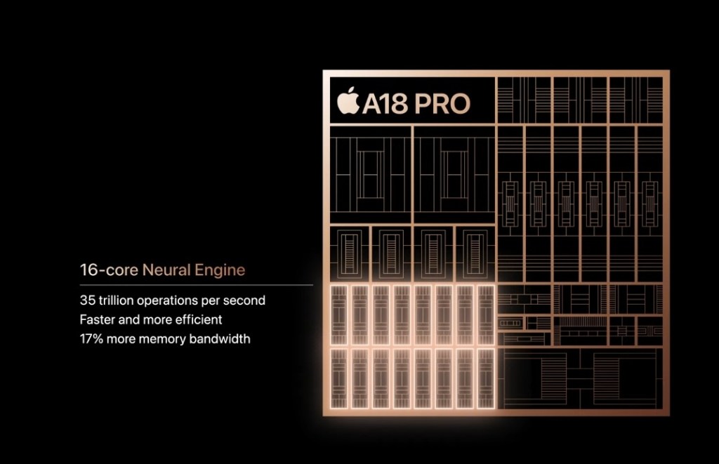
This brings us to the question – should you upgrade to an iPhone 16 to use Apple Intelligence? Unless you’re someone who upgrades their iPhone every year or you have a really old iPhone (like an iPhone 11), the answer is no. With so many features missing and some more restrictions, Apple’s AI, at its current state, isn’t a convincing reason to get the latest iPhone right away.
iOS 18 Has Been Underwhelming So Far
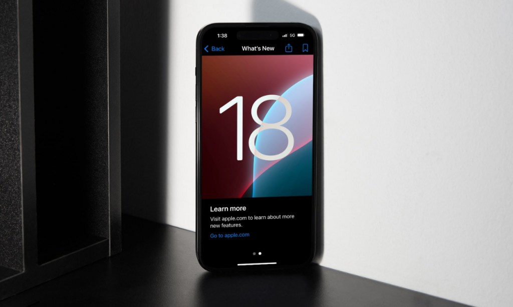
In Apple’s iOS 18 landing page, Apple Intelligence takes the top spot among the list of features showcased. But with its unavailablity for a wide range of devices, including the iPhone 15, iOS 18 is anything but the “biggest” update.
I’m not saying it’s bad. I’m glad that Apple finally gives me the freedom to personalize my homescreen and Control Center the way I want. Features like the new Passwords app or the ability to hide/lock apps have been welcome additions.
But in the grand scheme of things, I don’t consider this version a distinguishable upgrade over iOS 17. I say that because, iOS 18 hasn’t drastically changed the way I use my iPhone and certainly hasn’t made anything easier. Features like the revamped Photos app have only made me regret switching so early.
Apple Intelligence and its groundbreaking features are reserved for the iPhone 15 Pro and the newer models which makes iOS 18 all the more underwhelming.
What do you think about the iOS 18? Are you planning to install it on your iPhone right away? Then you can follow this install iOS 18 guide to know how to. If you have any doubt on this topic, let us know in the comments.


