
If you are a Windows user, then you are most likely familiar with the “Action Center”. The notifications panel that slides out from the right has a lot of quick settings and shows your recent notifications. The panel looks neat, however, it hasn’t gone through many changes design-wise since it was introduced for desktop with Windows 10 back in 2015. Well, a concept by Redditor, “BrunoAlvesIV”, shows a redesigned Action Center with a much cleaner look.
Shared in the Windows10 subreddit, the Redditor created an illustration of the Action Center that may never come to the platform in the future, but it is nice to see a redesign of the UI. The image shared by the user shows a white panel with rectangular blocks for notifications from different apps.
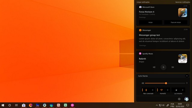
At the bottom, the panel shows some of the quick actions like the Wifi, Bluetooth and Brightness. There’s also a slider for the volume that is so much better than the current brightness slider. I mean, why would I need to set the brightness to a specific number? The volume slider makes more sense than the brightness slider. Below the quick actions, there’s also a settings icon and a profile picture of the user.
Surfing through the comments of the Reddit post, I found another user just inverted the colours of the image to show how the panel would look in a dark theme.
Well, not that I hope that Microsoft will change the design of the Action Center in the near future, but concepts like these show what could be improved with simple design changes.
What do you think about the concept? Do you like it? Do you hate it? Either way, let us know down in the comments.