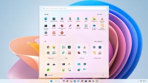
Hey Windows users, do you think the Windows 10 design looks good? If yes, I’d recommend you to not watch this Windows concept video. Trust me, it’ll completely ruin your desktop experience by making you realise that the current UI of Windows does not actually look that good.
Created by concept designer June Caspe, the concept video is said to be his “personal project” to showcase a “beautiful, friendly and intuitive user interface for Windows”. And he did uphold these attributes in his concept.
The video starts by showing off the different segments in the taskbar or shall I say taskbars, in this context. The designer, in his concept, has categorised the taskbar by creating small fragmented segments containing the icons and the programs. So, unlike the current taskbar that has a uniform design and is a single bar at the bottom, this design shows that creating different segments for different categories can really give a cleaner look to the OS.
Next, it showcases the redesigned “Start Menu” which also carried the “fragmented section” design. Now, this Start menu contains static flat icons of the programs instead of the dynamic “Live Tiles” of the current menu. Now, the designer did not completely ditch the “Live Tiles” concept. Icon blocks like Spotify and what looks like a block of Tony Stark’s personal messaging program, animated to reveal more information when the user hovered the pointer over these icons.
Now, the concept showed the new “File Explorer” and I was blown away by the minimalism. The window carried a translucent design language and looked C-L-E-A-N with the dark theme on. And when the window maximised, Oh! it was SMOOTH. The animation made me feel all warm and fuzzy inside! I wish the windows in the current version had animations like this throughout the OS.
Going forward in the video, it went on to show the different segments of the taskbar with an in-depth view and the new “Action Center” is also shown in detail. Well, this also had the same “fragmented section” look with the bottom section containing two control bars to manipulate the sound and the brightness and three quick settings icons that include Night Light, Bluetooth and Location. There is also an “Expand” button to expand the bottom section. The upper section contained all the notifications categorised by apps and at the top, there are three buttons to show all notifications, clear notifications and manage the notification settings.
This is one of the best Windows concepts that I have seen in a while and I think the concept creator did an impressive job.


