For the longest time, I have steered clear of Nothing’s flashy Glyph interface. Not because I didn’t want to make use of it, but it just didn’t seem all that practical to me, and I was content with using my OnePlus 11R. However, as the Nothing Phone 2a (review) landed, a strange spell of curiosity was cast upon not only our office but the tech world as well.
It just became this siren call I could no longer turn a deaf ear to. I had to see what the famed Glyph lights feature was all about, and hence, made the Nothing Phone 2a my primary device in the days leading up to the review. So, all that you’re going to read right now is purely from the perspective of someone who had more questions than answers about this very Glyph interface.
The Glyph Letdown is Real, But….
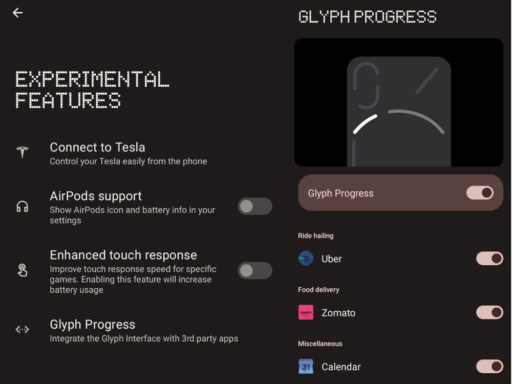
In my search for answers, I used Nothing Phone 2a’s Glyph lights as religiously as possible, trying to rely on it heavily during my time with it. The first thing that I immediately did (and I’m sure a lot of you will too) was order some food in an attempt to make use of the Glyph’s cool progress bar. Turns out, I used Swiggy and it wasn’t supported.
So, to use the progress bar feature, I had to switch to Zomato, which I personally don’t use much. I still did, and liked the concept of not having to constantly unlock my device to see how close the delivery partner is to my location. I can quickly take a quick peek at the Glyph strip and get an idea of their location.
Fast forward to day 2 of using it, where I had to book a Rapido ride (like I always do) to work. Guess what? Rapido’s not supported either, and you’ll need to get an Uber instead. Ola or InDrive are not supported yet as well. Big facepalm moment, indeed.

The only other app you can use in addition to Zomato and Rapido is Google Calendar, which I didn’t have any use for as well. I’m not going to get into the specifics of all these features, as my colleague Abubakar has prepared a detailed Glyph lights guide already.
But, then the Essential Notifications feature came sliding like a darling to sweep me off my feet. At least it tried to, and I found more use for it than any of the other all-lights-and-no-show Glyph features. Here’s why.
Cutting Through All That Noise is Easier
So, what this essential alert feature does is that it allows you to create a filter, through which only those notifications make it that concern you specifically. When such a notification lands on your device, the essential alert light on the Glyph Interface doesn’t turn off till you read or dismiss it.

Now, I don’t mind saying that I’m not that important a person to get hundreds of calls or thousands of texts in a day. Swiggy and Zomato’s thirst trap notifications, spam calls trying to dupe me out of money I don’t have, and a couple odd friends sending memes are only when my phone screen lights up.
In that case, the Essential Notifications feature helped me compartmentalize my notifications and pay attention to only the best out of the worst ones.
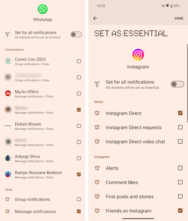
For example, I’m part of a few annoying WhatsApp groups that constantly ping and bug me. Yet, I can’t leave these Groups since I can’t afford to lose any more friends (sigh). So, what I did instead was set the feature to only work for select chats and not group ones. Moreover, based on my recent conversations, I could further filter and specify which of these individuals or groups I want the essential alerts to kick in for.

Similarly, with Instagram, I set it to light up only for DMs and not likes, comments, new followers or someone somewhere going live in the middle of the night. This allowed me to filter out the necessary from social media’s unnecessities and focus on memes (essential for survival).
The same goes for my work email address which, oftentimes, just gets these promotional emails that I don’t want to attend to. But, I can’t afford to miss out on any emails from my editor (I read all your emails, Anmol, I promise). So, I simply set the feature to give importance to only emails that land in my primary inbox.
Then comes Rapido, which I set to only give me alerts when a ride is confirmed or has arrived. So, all those other notifications trying to get me to grab a power pass and whatnot do not light up the Glyph. I have also blocked out marketing and promotional notifications from Swiggy and Zomato, so that I’m not manipulated into eating more.
These essential alerts made me place my phone carelessly on its display without worrying about missing anything important. This came in very handy during work meetings where unimportant notifications don’t scream and distract me. The need to constantly check your phone is also gone.
This is also useful when you are out enjoying with friends and using your phone instead is not the most polite thing to do. So, you can only get to your phone when it really deserves your attention.
Do you remember the small LED lighting we used to get on smartphones back in the day? And how this LED was important for a lot of people? Now, very sneakily, it has been pushed into the curse of oblivion and smartphones don’t feature one these days.
But, that light blinking during unattended notifications and going red when charging was a valuable addition to devices. Since it came at the front of your phone, the advent of always-on display simply made it irrelevant.
Nothing’s essential glyph lighting is just a more glorified, customizable, and flashier version of this notification LED. Moreover, being at the back, it attempts to create a conscious environment in that very position instead of trying to replace your always-on display.
Moreover, with all of these settings woven into my essential alerts, I can say that I have never had my phone placed display-ward for so long. While life was a little easier with most notifications not being able to breach the sanctum of my attention, I feel this feature too has a long way to go.
Is Less Too Little?

While these essential alerts and the Glyph lighting, in general, are crafted by Nothing to help you reduce your screen time instead of increasing it, there’s some contradiction. While these alerts let you in on the fact that you have a relevant notification, it doesn’t give you additional information about it.
Like, if the WhatsApp text I’m getting from an individual is even important or not. Or, if the Instagram DM you are getting is worth the attention. That is something that you need to anyway decide for yourself. Getting to customize it further for incoming calls by specifying contacts is also a good thing Nothing can be implemented.
Hence, understandably, I will have to do my bit and get to the display to see if a message is worth it. 6 out of 10 times, this will be a false positive, making you question the very existence of this feature; thinking is AOD better? That further elevates the importance of your Always-On display and why it is the better feature of the two, at least in my books.
Besides, when in a movie hall, the glyph staying lit up only becomes an annoyance for you and others. While the feature doesn’t want you to get distracted by unwanted notifications, the Glyph staying lit up only does the opposite. A breathing effect would have been way better than making these LEDs light up at all times.
Also, being able to set a timer of sorts to the alert glyph lighting to further classify notifications based on their importance would be a good bonus addition. The progress bar feature on the Glyph has a lot of potential too, and we can expect more developers to possibly adopt it with the developer kit now available.
There’s a whole lot of improvement and Nothing can certainly make this feature a lot more useful. The idea in itself, although elegantly innovative and brings quite the utility, isn’t there yet. At the end of the day, I’d rather come off as a smart individual who uses tech beautifully than a blockhead carrying a “torch” in my pocket.


