Beebom Score
Samsung has finally released One UI 7 as one of its biggest updates, bringing several changes and additions that fans and users were itching for. However, some folks are seeing parallels with Apple’s iOS and dubbing it a rip-off. Is this the case? Has the company delivered its most promising update, or merely pressed CTRL+V and called it a day? Let’s find that out in this review of Samsung’s One UI 7 update.
One UI 7: So Much To Like
Before I begin, I have been using One UI 7 on my Samsung Galaxy S24 since the first beta dropped back in December. Having used the Beta builds for over a month, there was a lot of good stuff which caught my eye, so let’s talk about it first.
A Bold Shift in Design
With One UI 7, Samsung has done a complete makeover of most UI elements. Booting up to the new version, you are greeted with bolder app icons, that look far more eye-catching than the flatter squircles that we were grown weary of. Stock apps like the Dialer, Gallery, Camera, Weather, and Clock have received a skeuomorphic treatment with saturated exteriors, helping them stand out against the backdrop.
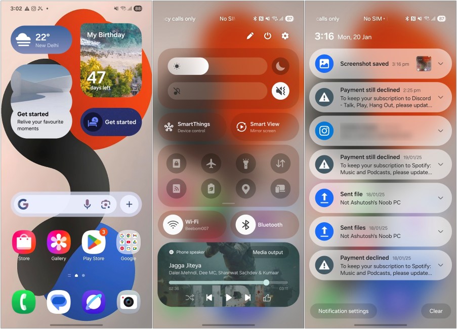
The entire UI feels more “bubbly”. The Quick settings toggles have more pronounced rounded corners, and a bouncy animation when you bring them down. The same goes for the Notifications panel, which is a separate page now. While I am not a fan of this change, it does help to make more room for notifications that appear larger and carry the same rounded pill-shaped aesthetics. But you can change back to the older style anytime you wish.
The Quick settings panel itself features a bunch of new changes. You’ll see that the brightness and volume sliders are bundled together now, pretty much like on iOS. So you can manage both from here. The toggles don’t have labels anymore, saving a lot of space in the process. While the rest of it will seem pretty familiar. But the best part is that you can now rearrange all these toggles and sections in any order you want.
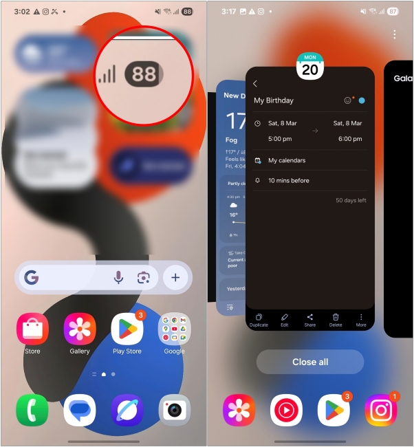
You can spot the same visual design in other UI elements. For instance, the new battery icon in the status bar and the Recents screen has a new stacking layout. One thing I like here is when you go to Recents from an app, it pulls the current app to the right, bringing the previous app into focus. It’s such a small addition, but one that makes so much sense in everyday use. But that’s merely the surface; digging deeper shows more of Samsung’s software sorcery.
Customization Galore
One UI is already infamous for all the customization it offers. Well, this update takes it a step further. As of now, you can hide app and widget labels on the home screen. There’s also a new option to let you change the app size to come up with a minimal home screen setup. Though there are only 3 options to choose from, but I’ll take what’s available.
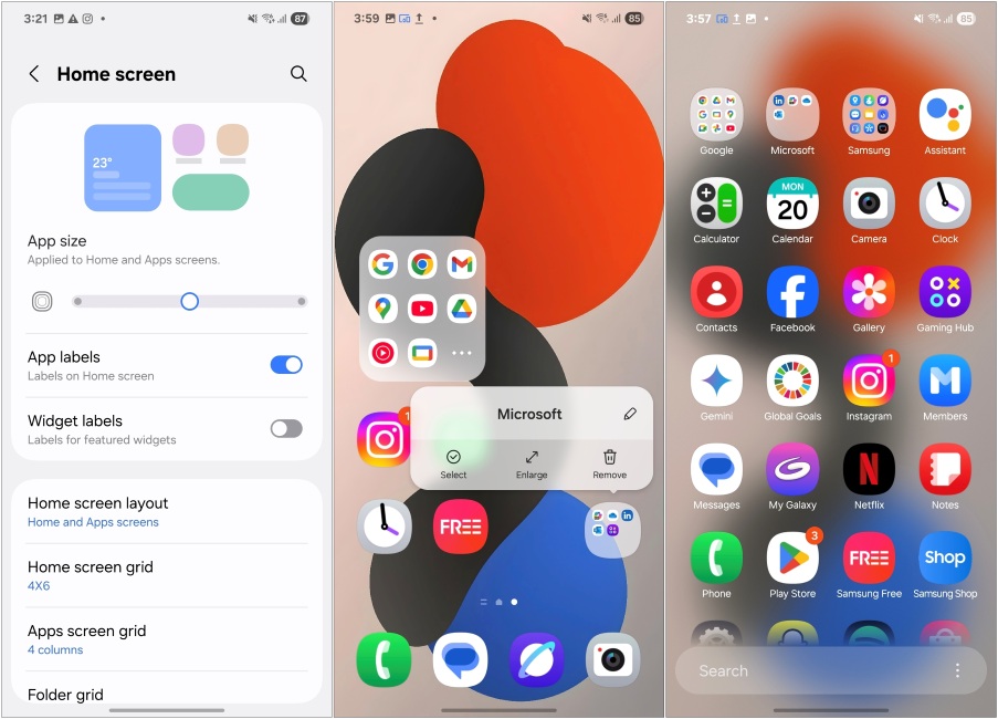
Moreover, you can enlarge folders to open apps within them directly. This is something we have seen in other Android skins. But one of the big changes that I am sure all Samsung users will be thrilled about, is the vertical app drawer which is finally here.
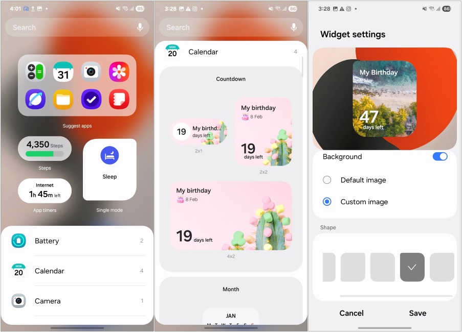
As for widgets, you can now change their shape and style, and they are available in far more different size options. There’s also more variety of widgets this time around for all stock apps like the countdown widget for the Calendar app that I used to prep for the New Year.
Lock Screen Also Got Some Love
While the One UI 6 update brought a lot of changes to the lockscreen, One UI 7 adds to it. The first thing you’ll notice is that they have moved the notification style to a different page. You can pick between three options, but by default, all your notifications will show up in a small pill in the top left corner. But it made it a hassle to check your notifications at a glance so I quickly changed back to the old style.
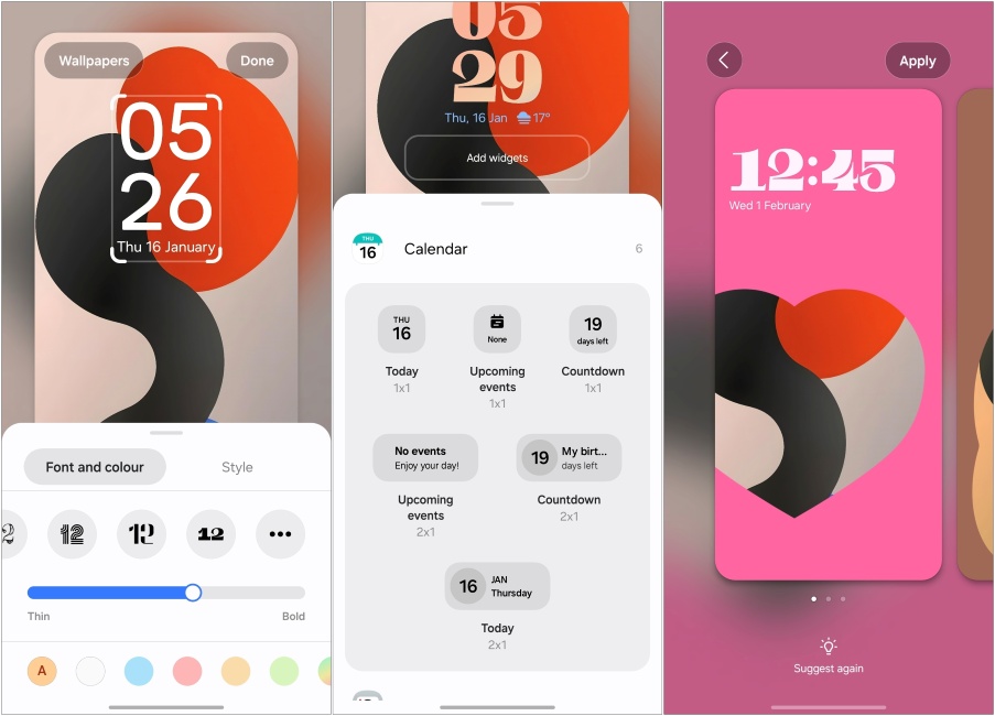
Then there’s the new option to increase clock width, some animated clock styles, more widgets for the lock screen, larger space to drag around the clock, and the option to get lock screen suggestions. There’s also a new Frame option that creates a dynamic 3D effect similar to what we saw with Oxygen OS 15. Though no depth effects to speak of. We have covered all the lock screen customizations in detail so you can check that out.
Now Bar and Live Activities
Besides the customization, the focus of the One UI 7 lockscreen will be the Now Bar (hands-on). This pill-shaped bar is what everyone’s been talking about ever since the beta rolled out. I wouldn’t shy away from saying that it is inspired by Apple’s Dynamic Island as it shows ongoing tasks and live activities. However, credit where credit is due. Samsung took a different and better approach to it.
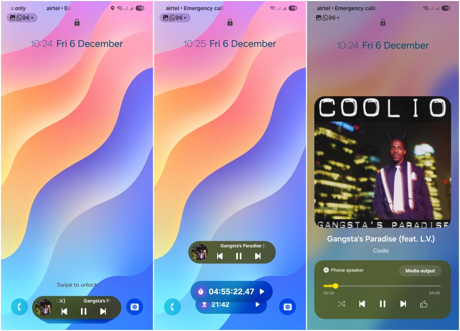
It shows more details and stacks multiple activities as well. The bar isn’t always present and only shows up when playing music, running timers, voice recording, or putting the phone to charge. I’ve noticed that like iOS, you can tap the album art to expand or minimize it, which is pretty cool. Once you unlock the device, all your live activities show up neatly in a small pill icon in the status bar.
Handy Camera App
Even the Camera app itself has received an overhaul, and for good reasons. I no longer need to stretch my thumb, or use the other hand to access photo modes since they’re now available from the bottom. The rest of the options that were previously available at the top, now reside inside the More button.
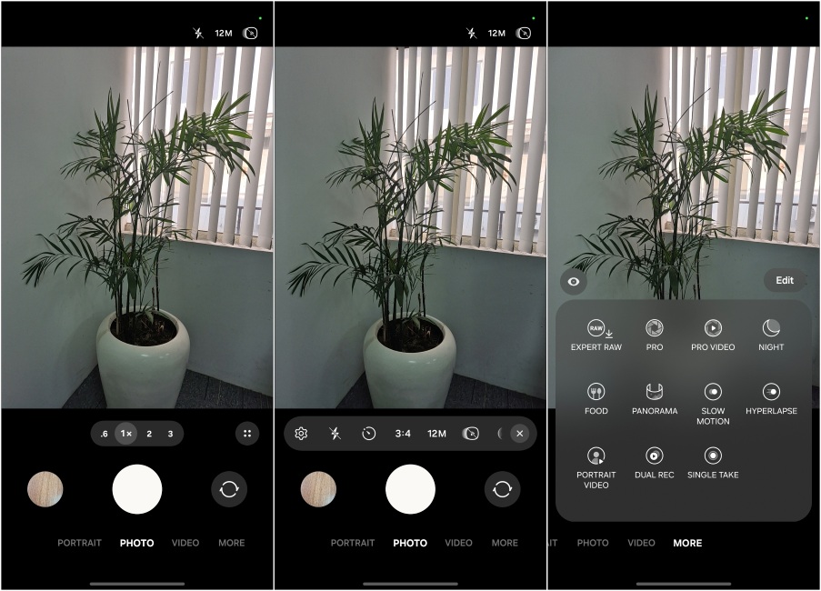
The Pro mode is also cleaner, and has a new, prominent slider to easily zoom in/out of videos. There’s also an exposure lock option here. If you head to the More option, you’ll see the rest of the camera features in a condensed window in the bottom half. Making things more one-hand friendly.
Fluid Animations and Accessible Interface
Samsung has tweaked the animations in One UI 7 to be more fluid and responsive. Everything from app opening-to-closing, pull-down quick settings, and navigating through the menus has a faster and bouncy effect to it. Maybe it’s just me, but the phone feels snappier now than it used to before. Everything just moves in motion, and not once does it feel out of place. It has its fair share of hiccups, but it’s nothing that can’t be ironed out with a few updates.
Better AI Integration
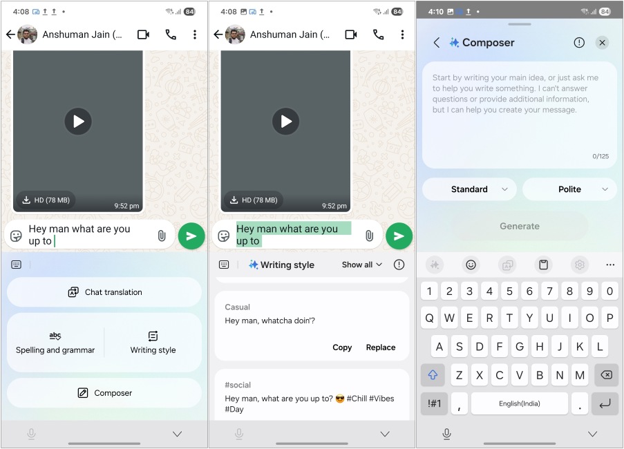
Samsung has even gone ahead and implemented a better AI integration throughout the OS with its writing tool feature. The option was previously limited to the Samsung Notes app, but now it is available everywhere. So I could use it on WhatsApp, where most of my personal conversations take place. While I am not a fan of AI in smartphones, this is one change I can actually see myself using. Its wider availability across multiple apps makes it a worthwhile addition to One UI 7.
They have also gone ahead and added AI Call transcripts to the Phone app. This also lets you record phone calls in the U.S. similar to what you saw on iOS 18. The transcription supports multiple languages and works fairly well, which is why I feel it tops Apple’s offering.
One UI 7: Things That I Don’t Like
This update mostly brought positive changes all around, but there are things that I didn’t enjoy and feel that Samsung should improve upon.
Notification Management is a Mess
While I am on board with these new looks, I do feel Samsung has gone a bit too overboard with the rounded corners on notifications. It takes up more space and requires me to expand it to glance at more information, which wasn’t the case before.
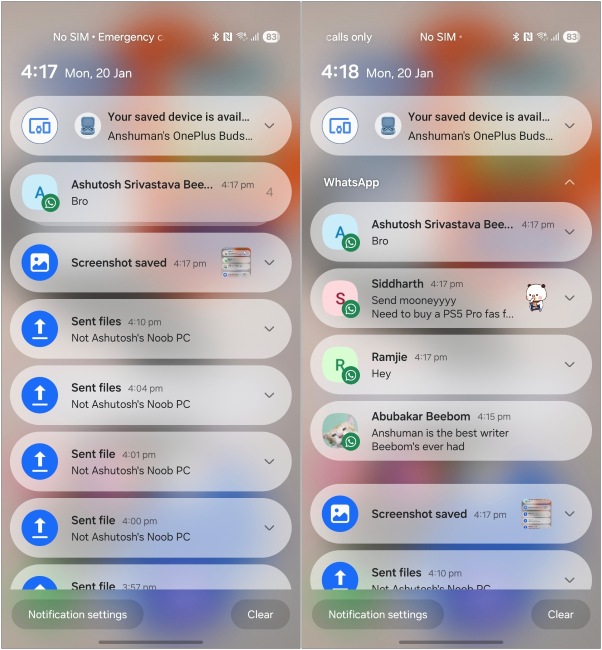
Samsung has also gone the iOS route of stacking similar notifications, and I am not a fan of it. One thing that Android does better than Apple is handling notifications. So why they went down through this change is beyond me.
Where is the Media Bar?
Samsung has done a tremendous job with the new media player, both on the lock screen and in the Notification shade. But the issue is, that it is a part of the Quick settings panel now. It’s not much of an issue if you are good with a separate page for Quick settings. But if you choose the merged layout, you’ll need to swipe down twice to access the media player.
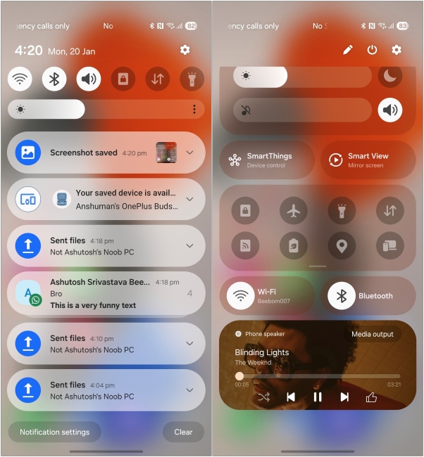
This is quite an annoyance to deal with, given that I listen to songs pretty often when commuting to and fro for work. I hope this isn’t a deliberate design decision and that Samsung fixes it soon.
Now Bar Needs More To Do
The Now bar itself is a pretty amazing addition to One UI 7. But in its current state, it has limited functionality. Apart from the tasks that I mentioned above, it can’t do much at all, and that boggles my mind. It’s as if you have a fast car at your disposal but take out its wheels, and I am not exaggerating here. It feels handicapped as of now.
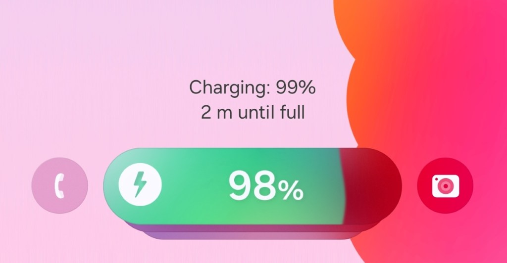
I would want Samsung to quickly roll out support for third-party apps, as that will drastically increase its prominence on my lock screen. Plus, this will make it an actually useful feature that it has the potential to be, rather than just a cool addition to the UI.
One UI 7 Verdict: A Step Towards “One” Hand-Friendly “UI”
Samsung’s One UI has become the default Android experience for many, so the company needed to nail a major overhaul such as this one. After using this skin through multiple betas, all I have to say is that Samsung and their team have achieved what they set out to do with One UI 7.
While the iOS parallels are obvious here, I wouldn’t ignore them. I will say that it isn’t wrong to copy the best parts of the other OS, and even Apple is at fault for doing it at times. I am glad that they focused on making One UI, one hand friendly again, but rearranging menus, and items in some areas, while offering customization in others.
One UI 7 doesn’t stand as the best Android experience, even after the praises I have sung in this review. I do think that this update pushes it as my second favorite option, and I’ll be happy to revisit it whenever the opportunity arrives.


