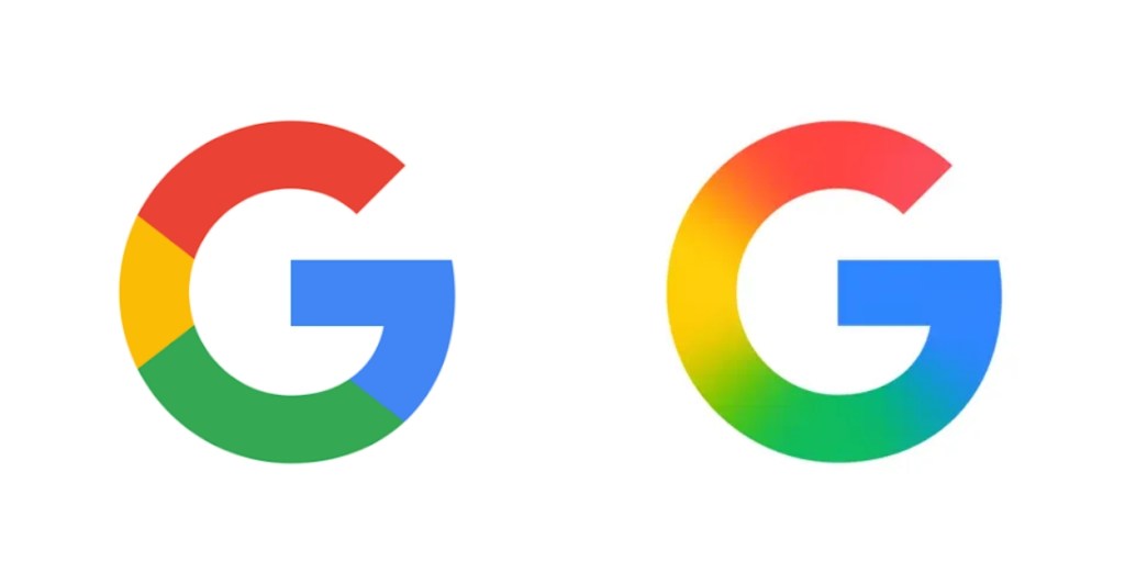
- Google has refreshed its iconic “G” logo for the first time in a decade.
- The updated design blends its signature red, blue, green, and yellow colors into a gradient instead of distinct sections.
- First spotted in the Google app on iOS, it’s now appearing on Android devices as well.
Google’s colorful “G” logo is one of the most iconic and instantly recognizable symbols out there. And it has remained this way ever since 2015. However, just a day before their upcoming Android show, Google has decided to give their icon a modern design refresh.
The new revamped “G” logo smudges the lines between the red, blue, green, and yellow colors into a gradient. Previously, these colors were clearly segmented into their own sections. This updated new look was first spotted in an update for the Google app on iOS, but is now also available on other Android phones.

The reason for this change is unclear at the moment, but I suspect it has something to do with their upcoming Android show on May 13th, which could showcase their new Material 3 Expressive design language for Android devices moving forward.
It isn’t a major change to begin with, as the font style of the “G” remains the same as before, and might go unnoticed by many. Still, it was worth pointing it out, since it’s not every day when Google decides to add some gradient. The last big change to their logo came back in 2015, when they updated the font to a sans-serif typeface.
What do you think about this updated Google logo? Do you like this design or prefer the old one? Let us know in the comment section below.
