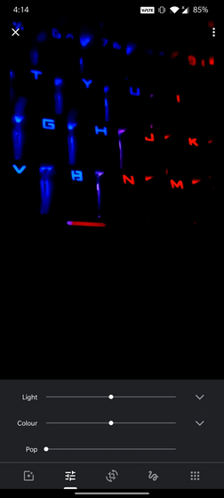
Media editor is arguably the most underrated aspect of Google Photos. Google Photos’ editor lets you apply filters, adjust the light, color, and can even stabilize videos. In an attempt to simplify the user interface, Google is now working on a redesign for Photos editor.
The changes were spotted by app reverse engineer Jane Manchun Wong. However, some users report having the feature on their devices. One Twitter user claims to have the feature on a Pixel 3 XL since last week. It was not live on my phone at the time of writing this article.
Google Photos is working on a new editor UI pic.twitter.com/GAK4NQCsIB
— Jane Manchun Wong (@wongmjane) August 25, 2020
In the redesigned version of Google Photos editor, the buttons are given more emphasis. As you can see in the image above, the redesign makes the interface more user-friendly and is certainly an improvement over the current slider design. In case you’re wondering, below is how the current editor UI looks like.

If you’re someone who prefers using full-fledged photo editor apps like Snapseed, Google Photos is making it straightforward to export the image to other apps through the ‘More’ section. Do note that this feature is also available in the old UI under extensions. Google has grouped the Extensions and Markup tool in the More section of the new UI.
Google seems to have partially rolled out the new editor to a limited set of users. We could expect the software giant to widely launch the feature over the coming weeks. Meanwhile, do let us know if you have the new UI in the comments.