WhatsApp doesn’t believe in wasting time when it comes to launching new features. We have seen a new Mac app, the screen-sharing feature, and the ability to send HD photos, among other things, and now, rumor has it that a big redesign is in tow for its Android app. Check out what might change below.
WhatsApp for Android New Design in the Works
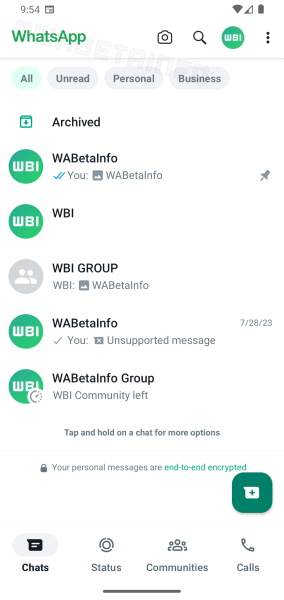
A recent report by WABetaInfo reveals that the Meta-owned messaging platform is testing a new beta update for its Android app, version 2.23.18.18, which will include a white top bar, as opposed to the current one in green. The revamp is based on Material Design 3.
But the green is not entirely going; there will be a few UI elements painted in green like the WhatsApp logo (which will see a change in the font), the ‘Archived icon,’ the ‘new chat’ icon, and more. The new design also showcases the navigation bar at the bottom, which has been rumored too. The idea is to unify the WhatsApp design across platforms, given that the iOS app already has a bottom navigation bar.
Other than this, we are likely to see new ‘All,’ ‘Read,’ ‘Personal,’ and ‘Business’ filter options at the top of the chats, making it easier for you to sort your messages and make things streamlined. Such changes are expected to arrive for WhatsApp’s iOS app too, making things the same for the messaging platform on both Android and iOS.

We can expect this on WhatsApp’s Windows and Mac apps too when it becomes officially available but we are not too sure. These changes are still being tested and there’s no word on when they will come into effect. This is likely to happen soon, so it would be best to wait for more details to arrive. Until then, stay tuned for further updates, and do share your thoughts on this in the comments below.