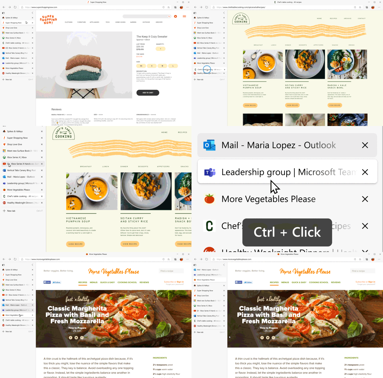
After bringing vertical tabs to a limited set of users in the Edge Canary channel this August, Microsoft is now widely rolling out the feature to testers in Edge Canary and Dev channels.
As the name suggests, vertical tabs will arrange all your tabs in a vertical fashion. Microsoft has placed the tab switcher to the left edge of the screen. This way, you can easily view and manage multiple tabs on Edge.

“Most websites are still designed with a narrower width that leaves unused space on either side of the content. Vertical tabs takes advantage of this unused space to show you more of your tabs without sacrificing how much content you can see at once. And with the ability to scroll through your tabs, you’re free to open as many as you want,” says Microsoft.
If you’re using Edge Canary or Dev, you can already try out the feature. Moreover, the option is present by default and you don’t have to dive into settings to find it. All you have to do is click on the vertical tabs icon present in the top-left corner of the browser.

Through this transition, you’re not missing out on features that you have with horizontal tabs. You can still pin tabs, select multiple tabs, and even mute the ones with media playing in the background.
What I like the most about vertical tabs is the option to collapse them when not in use. It saves space and elevates the overall aesthetic. You can also choose to always see the expanded pane by pinning it. If everything goes according to the plan, Microsoft should be bringing vertical tabs to beta and eventually to the stable version of Edge.