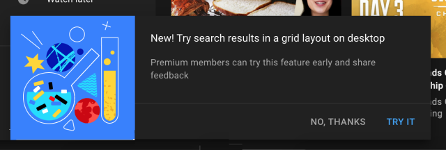
YouTube lets select users test new experimental features from time to time. We have recently seen the video streaming giant test huge playback controls on iOS and search filters on Android. And now, YouTube is testing a new grid layout for search results.
Earlier today, I received a prompt to test out the new “search results in a grid layout on desktop” feature. As should be evident, enabling this feature will show the search results in a horizontal grid instead of a vertical list. That means you will now be able to see more YouTube video results for your query on the search page.

You can see how the horizontal grid layout for the search results will look like in the image attached below. While I like that you can see more search results on a single page, there’s no way to increase the number of columns. You only have three columns and three results in each row on this new search page.

YouTube has been testing the grid layout with users over the past couple of months. A few users have spotted the feature, sharing screenshots on Twitter and Reddit. But, the opinion on this change has been divided. Most of them don’t like the change, but what are your thoughts on it? Let us know in the comments below. Also, if you want to try out this new grid layout for search, click on this link and sign up right away.
