YouTube has been revamping its music streaming service YouTube Music with various new features and personalized playlists in the recent past to compete with Spotify, Apple Music, and others. Now, the Google-owned company is testing a new “Add to Playlist” UI in YouTube Music to provide users with a clean yet informative interface.
New “Add to Playlist” UI in YouTube Music
The new “Add to Playlist” UI in YouTube Music was initially spotted by a Redditor recently. Although it looks similar to the current “Add to Playlist” UI, the new one comes with significant changes that improve the user experience drastically. However, it is worth mentioning that the new UI is still in its testing phase and contains various bugs and glitches.
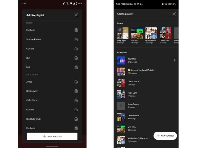
Now, comparing the new “Add to Playlist” UI with the old one, there are a few changes that you could see. Firstly, the new UI covers the whole width of the screen instead of being a floating card on top of the primary interface. This provides more room to accommodate more information about playlists and songs.

Coming to the second change, in the old UI, the playlists were shown in a simple list-view, with the recent playlists of the users pinned at the top of the screen for easy access. However, in the new UI, the recent playlists are shown in a swipeable carousel at the top along with the artworks of the included songs. Similarly, the “All Playlists” section also lists the remaining playlists of the users along with the album covers.
Another nifty change is that the new “Add to Playlist” UI shows the number of songs that are included in the playlists. Other than these, the “New Playlist” button, which used to be a full-fledged button covering the width of the screen, is now a floating action button (FAB).
Now, although the new “Add to Playlist” UI of YouTube Music lookS much better as compared to the current one, it still has many bugs and glitches. The redesigned UI is likely a part of Google’s A/B test, which means a select few beta testers are getting the new UI in the YouTube Music app. Hence, we expect YouTube to iron out the current bugs and glitches before rolling it out to the public.
So yeah, stay tuned for updates, and let us know your thoughts on the new “Add to Playlist” UI in YouTube Music down in the comments.