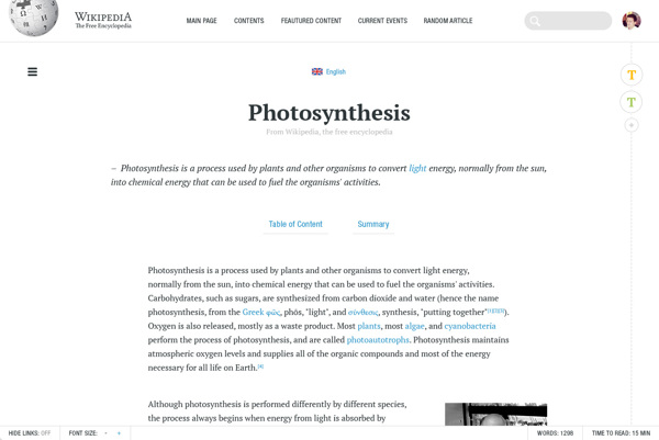
George Kvasnikov, Senior Interface and Graphic Designer from Germany has created an amazing re-design concept for Wikipedia. He has not just re-designed the whole site but also re-thought every aspect of the site from user’s point of view.
As we know there’s not much change brought up in the UI of Wikipedia since its inception in 2001 and that’s why George thought of the idea to make Wikipedia’s look more modern, more readable and more useful.
So, without wasting much time let’s check out the new Wikipedia.
Welcome The Grid


The New Reading Experience


Clear Structures, Rich Interactions


Integrated Text Editor


Mobile Version


SEE ALSO:
WhatsApp + Facebook UI/UX Design Concept
Google’s Logo Re-branding Experiment Design Concept
I hope you enjoyed the post. Share it with your friends on Facebook, Twitter, G+ etc and subscribe to our email newsletter for regular updates.
Courtesy: Behance


